Color is the place where our brain and the universe meet. |
| | Can you imagine if our world was devoid of color? A black and white existence? In the movie Pleasantville the main characters find themselves trapped in a black and white TV show set in the seemingly idyllic 1950’s. It’s only when they begin to experience raw emotions and raise questions about what lies beyond what they know that we see color brighten, enhance and expand their world. |
When I decided to write about color I didn’t have a real plan. As I began my research it became clear that there was a lot of information available. With so many qualified experts only a click away it seemed silly for me to try to educate you on the many facets of color. Instead, I decided to share with you some of the information that I found interesting and useful to me as a crafter.
Harmony and the Wheel
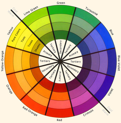
I am quite taken with the color wheel. To me it represents the science of color, and I can relate to the orderly way it presents information and options. After just a bit of study I can talk with (some) confidence about hue, tint, tone and shade. I know the difference between warm and cool colors. Color harmony or themes however struck me as an incredibly important concept, and it seems that an understanding of this would be useful in working with granny or any project.
The original color wheel is attributed to Sir Isaac Newton in 1704 which he discovered through his experiments with light and prisms. It provides us with several formulas for creating balance and harmony. I imagine that we use them often without realizing there is a name for our choices!
Here is a list of the most common themes and how they're made:
Monochromatic – use various values within the same color family
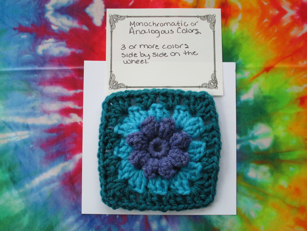
Analogous – 3 or more colors side by side on the wheel
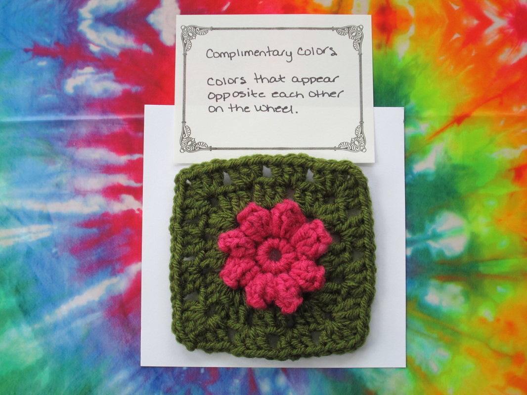
Complimentary or Direct Complimentary – are colors that appear opposite each other on the wheel
Split Complimentary – one color paired with 2 colors on either side of the color's direct complement creating a theme containing 3 colors
Double Compliment – 2 sets of complimentary colors that sit next to and across from each other on the wheel forming an X
Tetrad – 4 hues equal distance from one another forming a square or rectangle on the wheel
Diad – 2 colors located 2 steps apart on the wheel skipping the color in between
Triad – 3 colors equally spaced apart from one another forming an equilateral triangle on the wheel.
The original color wheel is attributed to Sir Isaac Newton in 1704 which he discovered through his experiments with light and prisms. It provides us with several formulas for creating balance and harmony. I imagine that we use them often without realizing there is a name for our choices!
Here is a list of the most common themes and how they're made:
Monochromatic – use various values within the same color family
Analogous – 3 or more colors side by side on the wheel
Complimentary or Direct Complimentary – are colors that appear opposite each other on the wheel
Split Complimentary – one color paired with 2 colors on either side of the color's direct complement creating a theme containing 3 colors
Double Compliment – 2 sets of complimentary colors that sit next to and across from each other on the wheel forming an X
Tetrad – 4 hues equal distance from one another forming a square or rectangle on the wheel
Diad – 2 colors located 2 steps apart on the wheel skipping the color in between
Triad – 3 colors equally spaced apart from one another forming an equilateral triangle on the wheel.
| 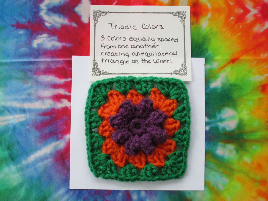
I made these squares to demonstrate different ways to create harmony. At first I wasn't sure how I felt about the purple, orange and green, but the wheel doesn’t lie, and in fact it has grown on me! In addition to the themes the wheel generates, nature is an outstanding source for telling us what colors go together. A walk in the woods, a sunrise or sunset, plants and animals - they all offer us suggestions for making the most of our colors. When you think about it, nature is the true source of our color - sun reflecting through drops of water to create a rainbow, and dyes made from plants are at the root of all we enjoy today! |
Granny in Color
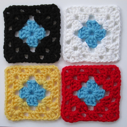
Grannies are excellent for experimenting with color. Making a square with potential colors for a project is a good way to see if they’ll live harmoniously or create a disturbance. It’s interesting to see how different colors effect one another. Take a look at these four squares. They all have the same blue center, but the outside color makes each one look and feel different. The placement of colors is important. Deciding what goes where will have a big impact on your project.
There are patterns for granny projects that use color in many ways. In pastels for babies, primary colors for kids and in varying shades to create an ombre effect. I’ve seen blankets that look like vibrant stained glass windows and that resemble a garden of wildflowers. I noticed on Pinterest that white is a popular boarder color, while the blankets from my childhood were done with black. If you’re designing your own afghan it can be hard to decide which color goes where. Creating random balance is harder than it seems! Check out The Granny Square Color Pattern Generator. Choose your colors (using a color wheel!), the number of colors per square and the number of squares in your blanket. Voila! It generates a pattern that is aesthetically pleasing - no spread sheets required!
Expanding Horizons
In the end, it all comes down to personal preference. We think about who we’re making the project for, how they will use it. What feeling are we trying to covey? Warm and cozy, bright and energetic, young and fresh or classic and timeless. The possibilities are as endless as our imagination.
Spending time learning about color has been a great experience. It has opened my eyes and made me curious. I’m interested in trying new combinations and expanding my horizons beyond my comfort zone. And granny is just the girl for me. With so many different ways to make the square, it is a small canvas where I can create with any colors I want. No matter what the wheel says!
Thanks so much for stopping by today. I hope that you enjoyed my adventures in color as much as I did and maybe you have been inspired to do some exploration on your own. Some of the sites that I used are:
Sensational Color, Pantone, CrochetCabana, Visual.ly, and The Psychology of Color.
I’m a member of the Come Blog-A-Long group on Ravelry and The Granny Square Project is my contribution to a Year of Projects. We’re all working on different things and come together once a week to share our stories. Please stop by to see what everyone has been up to.
If you’re interested in reading more about The Granny Square Project I’ve placed buttons on my sidebar for easy browsing.
Please join me next time for Part IV – Granny Flowers.
Until then friends I hope your day is filled with color!
Be blessed and stitch & read with love!
If you’re interested in reading more about The Granny Square Project I’ve placed buttons on my sidebar for easy browsing.
Please join me next time for Part IV – Granny Flowers.
Until then friends I hope your day is filled with color!
Be blessed and stitch & read with love!
18 Comments
8/20/2012 05:29:10 am
It's fun to see the colour combinations. Your monochromatic choices are particularly pleasing to me. I think intensity of hue has an important role to play as well. Fair Isle is another fun way to play with colour and contrast.
Thank you so much for writing this article! I worked with colours and tried to sell my Crochet products in a fleemarkt. But it was not so successful. One of my friend told me, that she was afraid that my colour combination is not so attractive. I was searching for information about colours and then just saw this article in time! Thank you!
Holy Crap..you've gone and dragged me into the color world..and made it very interesting...I might owe a few people apologies cuz they follow the color wheel for everything in their lives ie: My friend paid good money to have her colors done..what? Only wear clothes in their color group...etc... Now I see how pervasive color is in one's life..
when i started reading this post I thought of the book "The Giver" by Lois Lowry... A book IMHO should be on every school's reading list at some point in a kids life..
thanks for a wonderful series..
Interesting post, I looked at my colour loves a few months ago and it's funny how I don't always work with colours I love, but then I do like all sorts of combinations. The thing I like about grannys, that ven in their limited stitches, you can produce so many variations with changing just a few small things.
Robin, I sent you a private message on Ravelry. Please look for me there as tracyann3369.
Basically, I'm loving your blog and begging you to guest write an article for me. My website has a section about the use of color but comes up embarrassingly short on any valuable content about the color wheel. I never learned to use one so have very little to offer regarding the tool.
You can reach my on Ravelry or email me directly [email protected]
Looking forward to hearing from you!
WOW! I enjoy reading your articles so much, I am terrible with colours and I normally play it safe, and often I find that what I like in yarn doesn't always transform well in projects, that's why I hardly ever do colourwork, LOL. Thanks for your well thought and well written post!
9/1/2012 01:12:29 pm
What a great experiment with color. I love the tertiary color square.
10/22/2012 05:54:21 pm
I am writing this note because I do not know where to begin. I would
like to crochet a little more. I do very little. Have always loved granny
squares. Can you tell me where to begin?.
gabriela
8/5/2013 05:48:58 am
I tried "The granny square color pattern generator", but i couldn't print "my blanket" .Do you know how can i do this?
Thank you.
6/7/2014 02:11:05 pm
your blog is very interesting, I will visit again in the next article
<a href="http://goo.gl/hYfjuF">rahasia besar cara memikat wanita idaman anda</a>
Leave a Reply.
- Greetings!
I'm Robin and this is
Crochet Nirvana, where
laughter is essential,
learning is supported,
creativity is nurtured, and sharing is encouraged.
Thanks for stopping by,
I hope you
enjoy your visit!

Click to see what's new on the Craftsy Crochet Blog!
Follow Along

Tutorials and Patterns
On Instagram


Look for me, I'm RobinBrz


Places I Post


Archives
July 2015
June 2015
February 2015
January 2015
December 2014
November 2014
October 2014
September 2014
July 2014
June 2014
April 2014
March 2014
January 2014
December 2013
October 2013
September 2013
August 2013
July 2013
June 2013
May 2013
April 2013
March 2013
February 2013
January 2013
December 2012
November 2012
October 2012
September 2012
August 2012
July 2012
June 2012
May 2012
April 2012
March 2012
Categories
All
4kcbwday1
4kcbwday2
4kcbwday3
4kcbwday4
4kcbwday5
4kcbwday6
5 Minute Friday
Accessories Home
Accessories - Home
Afghans
Amigurumi
Art
Bags
Beads & Beading
Blogging
Blog Reviews
Blogtoberfest 2012
Blog Week Iv
Book Reviews
Books
Cables
C A L
Cardigan
Chevron Lace
Class Review
Coasters
Cowl
Craftsy
Creative Friday
Crochet
Crochet Lace
Doily
Doodles
Downloadable Files
Earrings
Fabric
Fiber Arts Friday
Fingerless Gloves
Flowers
F O Friday
Giveaways
Granny Square Project
Granny Squares
Guest Post
Hats
Holiday Stashdown
How To
I Love Yarn Day
Inspired Crochet
Jewelry
Kcco
Knit Lace
Knitting
Library
Mittens
Nirvana Designs
Patterns
Pincushions
Projects
Recipes
Sewing
Shawl
Shrug
Socks
Socs
Stash
Stitch Markers
Thread Crochet
Tunisian Crochet
Tutorials
Videos
Watercolors
Wip Wed
Wrap
Wrist Warmers
Writing In The Raw
Yarn
Yarn Along
Year Of Projects


Thank you for visiting!
My name is Robin. I am a wife, mother and strong believer in the power of faith. I'm a maker, a crafter and an artist. I love exploring new mediums and sharing my adventures with you.
Did you enjoy your visit? Let me know by leaving a comment. I love knowing you dropped by, and hope to see you again soon!
Be Blessed and
Stitch & Read with Love!